


ItemsControl
さて、先ほどご説明したとおり、今回の本題の一つ目であるTreeViewコントロールはItemsControlと呼ばれるクラスの派生クラスになります。
ItemsControlは前述したコンテンツモデルのコントロールの中でも「項目のコレクション」となっていることから分かるように配列やList<T>などのコレクションオブジェクトを取り扱うことができるコントロールです。
そのため、コレクションを取り扱うためのコンテンツプロパティとして、ItemsプロパティとItemsSourceプロパティが用意されています。それぞれの利用方法について順番に説明します。
Itemsプロパティ
ItemsプロパティはItemCollection型で、その名前のとおりItemsControlに表示する任意オブジェクトのコレクションを格納・管理するプロパティとなっています。
つまり、ItemsControlに対して、任意オブジェクトの追加・参照・削除が行えます。
ItemCollectionクラスのAddメソッド, Removeメソッドなどを使って個々のデータの追加・削除が行えます。
それでは早速TreeViewコントロールを使って、Itemsプロパティによる、追加・削除を行うサンプルプログラムを見てみましょう。
- サンプルプログラム1: 01-TreeViewItemsProperty.zip
<UserControl x:Class="_01_TreeViewItemsProperty.MainPage"
    xmlns="http://schemas.microsoft.com/winfx/2006/xaml/presentation"
    xmlns:x="http://schemas.microsoft.com/winfx/2006/xaml"
    xmlns:d="http://schemas.microsoft.com/expression/blend/2008"
    xmlns:mc="http://schemas.openxmlformats.org/markup-compatibility/2006"
    mc:Ignorable="d"
    d:DesignHeight="300" d:DesignWidth="400"
    xmlns:sdk="http://schemas.microsoft.com/winfx/2006/xaml/presentation/sdk">

    <Grid x:Name="LayoutRoot" Background="White">
        <Grid.ColumnDefinitions>
            <ColumnDefinition Width="*" />
            <ColumnDefinition Width="*" />
        </Grid.ColumnDefinitions>
        <Grid.RowDefinitions>
            <RowDefinition Height="Auto" />
            <RowDefinition Height="*" />
        </Grid.RowDefinitions>
        <Button Content="Add" Name="btnAdd" Margin="5" Click="btnAdd_Click" />
        <Button Content="Remove" Grid.Column="1" Name="btnRemove" Margin="5" Click="btnRemove_Click" />

        <sdk:TreeView Name="treeView1" Grid.Row="1" Grid.ColumnSpan="2" Margin="5" />
    </Grid>
</UserControl>
また、Buttonコントロールのイベントハンドラの実装が必要となりますので、コードビハインドは以下のように実装します。
/// <summary>
/// Addボタンイベントハンドラ
/// </summary>
/// <param name="sender"></param>
/// <param name="e"></param>
private void btnAdd_Click(object sender, RoutedEventArgs e)
{
    //ItemsプロパティのAddメソッド
    treeView1.Items.Add(string.Format("Item {0}", treeView1.Items.Count));
}

/// <summary>
/// Removeボタンイベントハンドラ
/// </summary>
/// <param name="sender"></param>
/// <param name="e"></param>
private void btnRemove_Click(object sender, RoutedEventArgs e)
{
    //カウンターが0となれば実行しない
    if (treeView1.Items.Count <= 0) return;

    //Itemsプロパティのデータの削除
    treeView1.Items.RemoveAt(treeView1.Items.Count - 1);
}
実行結果は以下のような形になります。

まだ、単一のコレクションオブジェクトを追加しただけなので、階層表示は行われませんが、Addボタン、Removeボタンをクリックすることで、ItemsControlの項目の追加・削除が行われる様子は確認できると思います。
ItemsSourceプロパティ
前述のように1つずつオブジェクトをItemsプロパティに追加する以外にもすでに存在する配列やListなどのコレクションオブジェクトをコントロールに直接指定するプロパティが用意されています。それがItemsSourceプロパティです。
ItemsSourceプロパティにはIEnumerableインターフェースを実装したコレクションオブジェクトを指定できます。
IEnumerableインターフェースは.NETでの配列の親クラスであるArrayクラスやSystem.Collection名前空間などにある主要なコレクションオブジェクトで実装されていることから、これらのコレクションオブジェクトはItemsSourceプロパティにそのまま指定できます。
本日の本題であるTreeViewコントロール、XamTreeDataコントロールはいずれもItemsSourceプロパティを持っています。
それでは、早速コレクションオブジェクトを表示するためのサンプルプログラムを見てみましょう。
こちらのサンプルプログラムはXamDataTreeを利用していますので、プロジェクトで「参照の追加」するなど、関連コンポーネントを追加する必要がありますが、先ほどご紹介したNetAdvantageはインストールされているとツールボックスに表示されますので、ドラッグ&ドロップだけで簡単にXAMLに追加することができます。

最終的には以下のようにTreeViewコントロール、XamDataTreeコントロールを追加し、UserControlへLoadedイベントを追加します。
- サンプルプログラム2: 02-ItemsSource.zip
<UserControl x:Class="_02_ItemsSource.MainPage"
    xmlns="http://schemas.microsoft.com/winfx/2006/xaml/presentation"
    xmlns:x="http://schemas.microsoft.com/winfx/2006/xaml"
    xmlns:d="http://schemas.microsoft.com/expression/blend/2008"
    xmlns:mc="http://schemas.openxmlformats.org/markup-compatibility/2006"
    mc:Ignorable="d"
    d:DesignHeight="300" d:DesignWidth="400"
    xmlns:sdk="http://schemas.microsoft.com/winfx/2006/xaml/presentation/sdk"
    xmlns:ig="http://schemas.infragistics.com/xaml"
    Loaded="UserControl_Loaded">

    <Grid x:Name="LayoutRoot" Background="White">
        <Grid.ColumnDefinitions>
            <ColumnDefinition Width="*" />
            <ColumnDefinition Width="*" />
        </Grid.ColumnDefinitions>
        <sdk:TreeView Name="treeView1" />
        <ig:XamDataTree Grid.Column="1" Name="xamDataTree1" />
    </Grid>
</UserControl>
Loadedイベントハンドラは以下のようにLINQを使ってstring型のコレクションオブジェクトを生成し、各コントロールのItemsSourceプロパティに設定します。
private void UserControl_Loaded(object sender, RoutedEventArgs e)
{
    var stringItems = Enumerable.Range(1, 10).Select(i => string.Format("Item {0}", i));

    treeView1.ItemsSource       = stringItems;
    xamDataTree1.ItemsSource    = stringItems;
}
実行結果は以下のとおりです。
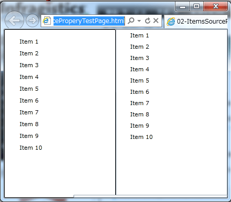
それぞれのコントロールの描画方法が異なることから若干表示されるイメージが異なりますが、いずれも同じように各項目を表示できます。
また、XamDataTreeコントロールでは、特定のエンティティクラスなどを指定する場合、DisplayMemberPathプロパティにプロパティパスを設定することで表示項目を指定できます。
それではサンプルとして以下のようなエンティティクラスを定義します。
- サンプルプログラム3: 03-DisplayMemberPath.zip
public class Person
{
    public string Name { get; set; }

    private ObservableCollection<Person> _children = new ObservableCollection<Person>();

    public ObservableCollection<Person> Children
    {
        get { return _children; }
    }
}
そして、XAMLは以下のように作成します。
<UserControl x:Class="_03_DisplayMemberPath.MainPage"
    xmlns="http://schemas.microsoft.com/winfx/2006/xaml/presentation"
    xmlns:x="http://schemas.microsoft.com/winfx/2006/xaml"
    xmlns:d="http://schemas.microsoft.com/expression/blend/2008"
    xmlns:mc="http://schemas.openxmlformats.org/markup-compatibility/2006"
    mc:Ignorable="d"
    d:DesignHeight="300" d:DesignWidth="400"
    xmlns:sdk="http://schemas.microsoft.com/winfx/2006/xaml/presentation/sdk"
    xmlns:ig="http://schemas.infragistics.com/xaml"
    Loaded="UserControl_Loaded">

    <Grid x:Name="LayoutRoot" Background="White">
        <ig:XamDataTree Grid.Column="1" Name="xamDataTree1"
                        DisplayMemberPath="PersonName" />
    </Grid>
</UserControl>
そして、前のサンプル同様、Loadedイベントに対して上記エンティティクラスを表示するために以下のようにコーディングします。
private ObservableCollection<Person> persons;

private void UserControl_Loaded(object sender, RoutedEventArgs e)
{
    persons = new ObservableCollection<Person>
                    {
                        new Person { PersonName = "しるば太郎" },
                        new Person { PersonName = "しるば次郎" },
                        new Person { PersonName = "しるば三郎" },
                        new Person { PersonName = "しるば四郎" },
                        new Person { PersonName = "しるば五郎" }
                    };

    xamDataTree1.ItemsSource    = persons;
}
実行結果は以下のように表示されます。