


フレームワーク・部品の作成
ポータル・スケジューラーを作成するにあたり、はじめにフレームワーク・部品の作成を行いました。作成した部品をいくつか紹介していきます。Curlは標準コントロールを継承することで簡単に機能拡張を行うことができます。
拡張したのはどれも小さな機能ですが、さまざまなアプリケーション開発で応用できる部品となっていると思います。
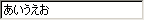
数値だけしか入力できないTextField
入力内容によっては、その値を制御したい場合があります。TextFieldクラスのreplace-selection-with-stringメソッドをオーバーライドすることによって、入力できる文字を簡単に制御できます。
{define-class public MyNumericField {inherits TextField}

  {constructor public {default ...}
    {construct-super ...}
  }

  {method public {replace-selection-with-string p_value: StringInterface}: void
    ||入力されたものが数値でない場合は空文字にする
    {if not {"0123456789.-".find-string p_value} then
      set p_value = "";
    }
    {super.replace-selection-with-string p_value}
  }
}
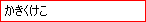
ボーダー色を変更したTextField
TextFieldのUIクラスをカスタマイズすることによりTextFieldのボーダーの色を変更したり、ボーダー無しにすることが簡単にできます。入力した値がエラーの時、修正を促すといったときの表現方法として応用できると思います。
{define-class public MyTextField {inherits TextField}

  {constructor public {default ...}
    {construct-super ui-object = {MyTextFieldUI}, ...}
  }

}

{define-class public MyTextFieldUI {inherits StandardTextFieldUI}

  {constructor public {default control: #TextField = null, ...}
    {construct-super control = control, ...}
    ||ボーダー色を赤に設定する
    set self.border-width = 1pt,
        self.border-color = "red"
  }
  {method protected {overdraw-control renderer2d: Renderer2d}: void}
}
イメージを使用したCommandButton
ボタンのUP状態、マウスオーバー状態、マウスダウン状態のイメージをそれぞれ準備すれば、イメージでボタンを作成できます。こういった画像を用意することで、標準のものを使用するより見栄えをよくすることができます。使用できるイメージ形式は、GIF、PNG、BMP、JPG、TIFFです。


{define-class public MyImageButton {inherits CommandButton}

  {constructor public {default ...}
    {construct-super style  = CommandButtonStyle.label-only,
                     cursor = {Cursor.get-hand-cursor}, ...}
    set self.reactive-label = {ReactiveLabel
                                label          = {image source = {url "normal.gif"}},
                                label-rollover = {image source = {url "rollover.gif"}},
                                label-pressed  = {image source = {url "pressed.gif"}}
                              }
  }

}
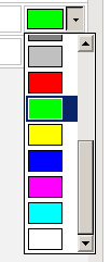
カラー選択DropdownList
DropdownListのアイテムをグラフィックで表現できます。RectangleGraphicクラスで四角形を作成して色を選択するDropdownListを作成しました。このパーツを利用することで、例えば文字色を変更するGUIを提供できるようになります。
{define-class public MyColorDropdownList {inherits DropdownList}

  {constructor public {default ...}
    {construct-super ...}
    {self.append {RectangleGraphic fill-color = "#000000"}}
    {self.append {RectangleGraphic fill-color = "#800000"}}
    {self.append {RectangleGraphic fill-color = "#008000"}}
    {self.append {RectangleGraphic fill-color = "#808000"}}
    {self.append {RectangleGraphic fill-color = "#000080"}}
    {self.append {RectangleGraphic fill-color = "#800080"}}
    {self.append {RectangleGraphic fill-color = "#008080"}}
    {self.append {RectangleGraphic fill-color = "#808080"}}
    {self.append {RectangleGraphic fill-color = "#c0c0c0"}}
    {self.append {RectangleGraphic fill-color = "#ff0000"}}
    {self.append {RectangleGraphic fill-color = "#00ff00"}}
    {self.append {RectangleGraphic fill-color = "#ffff00"}}
    {self.append {RectangleGraphic fill-color = "#0000ff"}}
    {self.append {RectangleGraphic fill-color = "#ff00ff"}}
    {self.append {RectangleGraphic fill-color = "#00ffff"}}
    {self.append {RectangleGraphic fill-color = "#ffffff"}}
  }

}
DropdownListのアイテムはVisualクラス(画面に表示できるコントロールの基底クラス)です。そのため、画面に表示できるものすべて、例えばドロップダウンリストにCommandButtonなどを含めることができ、とても汎用的に使用することができます。
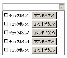
{define-class public MyDropdownList {inherits DropdownList}

  {constructor public {default ...}
    {construct-super ...}
    {self.append
      {HBox spacing=5pt,
        {CheckButton label="チェックボタン1"}, {CommandButton label="コマンドボタン1"}
      }
    }
    {self.append
      {HBox spacing=5pt,
        {CheckButton label="チェックボタン2"}, {CommandButton label="コマンドボタン2"}
      }
    }
    {self.append
      {HBox spacing=5pt,
        {CheckButton label="チェックボタン3"}, {CommandButton label="コマンドボタン3"}
      }
    }
    {self.append
      {HBox spacing=5pt,
        {CheckButton label="チェックボタン4"}, {CommandButton label="コマンドボタン4"}
      }
    }
    {self.append
      {HBox spacing=5pt,
        {CheckButton label="チェックボタン5"}, {CommandButton label="コマンドボタン5"}
      }
    }
  }

}
表示できない部分を省略して表示するラベル
今回のアプリケーションでは、文字列が指定した幅で表示できない場合に表示できない部分を省略するラベルを作成しました。ラベルの幅によって動的に表示が変わります。文字を描画したときの幅を取得できるAPIを使って実現しています。


{define-class public MyContentsLabel {inherits Fill}

  field private _label: String

  {constructor public {default label: String = "", ...}
    {construct-super ...}
    set self._label = label
  }

  {method public {draw r2d: Renderer2d}: void
    let v_bounds: GRect = {self.layout.get-bounds}
    {with-render-properties
      font          = {Font self.font-family,
                        self.font-size,
                        weight = self.font-weight,
                        style  = self.font-style
                      },
      translation   = {Distance2d
                        -v_bounds.lextent,
                        -v_bounds.ascent
                      },
      translation-y = {r2d.get-font-ascent}
      on r2d do
      {r2d.render-string
        0pt, 0pt,
        {self.my-minimize-string
          self._label,
          v_bounds.width
        }
      }
    }
  }

  ||文字列が指定した幅に表示できない場合は後ろに省略記号をつける
  {method private {my-minimize-string p_value: String,
                                      p_maxwidth: Distance
                  }: String
    let v_ret: String    = p_value,
        v_size: int      = p_value.size,
        v_buf: StringBuf = {StringBuf}
    {if v_size <= 1 or
        {self.my-get-text-width p_value} <= p_maxwidth then
      {return v_ret}
    }
    {for c: char in p_value do
      {if {self.my-get-text-width
            {v_buf.to-String} & c & "…"
          } < p_maxwidth then
        {v_buf.append c}
      else
        set v_ret = {if v_buf.empty? then
                      {p_value.substr 0, 1} & "…"
                    else
                      {v_buf.to-String} & "…"
                    }
        {break}
      }
    }
    {return v_ret}
  }

  ||文字列を描画した時の幅を取得する
  {method private {my-get-text-width p_value: String}: FloatDistance
    {return
      {{self.get-display-context}.get-string-advance-width
        {Font self.font-family,
              self.font-size,
              weight = self.font-weight,
              style  = self.font-style
        },
        p_value
      }
    }
  }

}